
The World Cup Kit Moments That Defined Each Decade Since 1970
Every World Cup leaves behind one kit that refuses to die — the shirt that survives the tournament's cultural expiry date and turns up decades later in retro shops, archive articles, and Instagram throwback posts. Most tournaments produce forgettable kits. A handful produce icons. And the icons are almost never accidents: they're the intersection of a specific team, a specific manufacturer, a specific design trend, and a moment in history that the kit ends up absorbing.
This is the story of eleven of those moments — one per tournament from 1970 to 2022 — the shirts that defined the era, why they mattered when they arrived, and why, in 2026, we're still borrowing from their visual language.
Mexico 1970 — Brazil home
The 1970 Brazil home is the one everyone agrees on. Canary yellow, royal-blue trim, number typography that became the default for the entire decade of international football. Pelé, Jairzinho, Tostão, Gérson, Rivellino, Carlos Alberto — five of the greatest Brazilian players ever, all in the same side, photographed in colour for the first time at a World Cup. (Mexico 1970 was the first tournament broadcast globally in colour.) The kit didn't just survive the tournament. It defined how we picture Brazilian football forever.
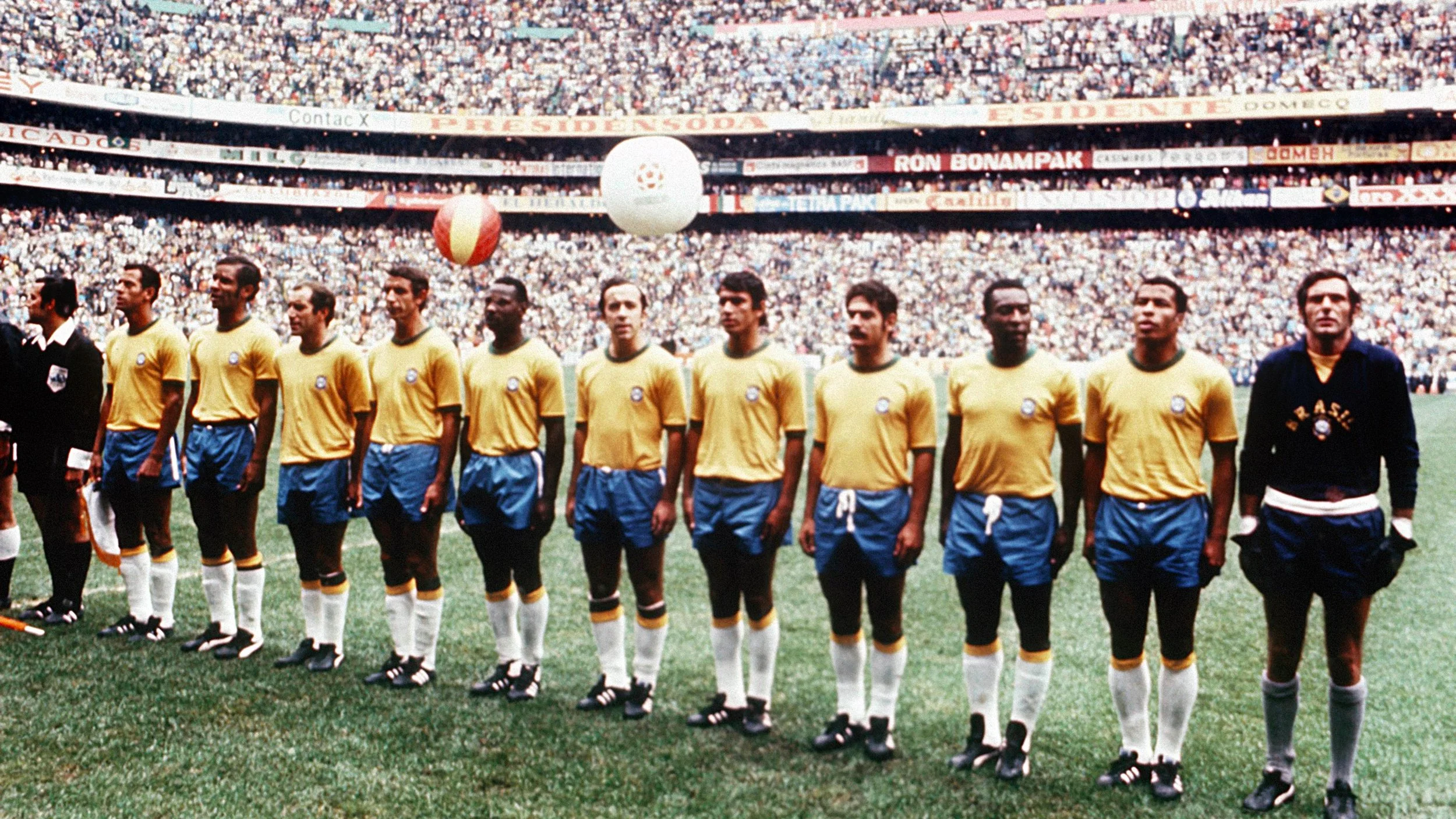
What makes 1970 so foundational is that colour TV amplified its simplicity. The yellow didn't need patterns or panels or modern sportswear innovation — it just needed to exist and be seen. The image of Pelé in that shirt, arms spread wide after the 4-1 final win over Italy, is still the single most-reproduced photograph in football history. Every subsequent Brazil shirt has been measured against it. Most have fallen short.
West Germany 1974 — Netherlands home
If 1970 was about tradition made perfect, 1974 was about disruption. Adidas introduced the three-stripe shoulder treatment on the Netherlands home kit — bold, orange, unmistakable — and Rinus Michels's Dutch side wore it while reinventing football itself. Total football, Cruyff turns, the Cruyff number 14, the roaring semi-final demolition of Argentina: the shirt was already iconic before it lost the final.
The broader significance is that 1974 was the first World Cup where the manufacturer became visually central. Adidas's three stripes on the sleeves and shoulders weren't just branding — they were a design statement that said sportswear now had authors. Every tournament since has had a three-manufacturer arms race. Every tournament since 1974 has been at least partly about what Adidas, Nike, and Puma are trying to say. The Dutch orange was the kit where that conversation started.
1978 — Argentina home
Argentina 1978 is politically the most fraught World Cup. It is also, as a piece of kit design, one of the most enduring. Adidas's sky-blue-and-white vertical stripes, paired with a simple black shorts and white socks, set the template that every Argentina shirt since has had to decide whether to copy or break from. (Mostly: copy.) Mario Kempes's celebration after his final-winning goal against the Netherlands — shirt sleeves rolled up, long hair, the vertical stripes crisp against the River Plate stadium's black and white crowd — is an image every Argentina fan can picture without effort.
The striping itself was not new; Argentina had worn variants of it since 1904. What 1978 added was the marriage of the stripes to modern sportswear construction: Adidas's technical approach to a traditional colour scheme. The 2026 Argentina home, with its subtle vertical-gradient nod to the 1994 USA variant, is really still operating within the visual language that 1978 codified.
1982 — Italy home
Paolo Rossi's Italy. Dino Zoff lifting the trophy. Enzo Bearzot's counter-attacking tactics beating Brazil's "o Jogo Bonito" in perhaps the greatest World Cup match ever played. The 1982 Italy home was Le Coq Sportif's most important commission — classic azzurro blue, the Italian flag on the collar, four stars now above the shield after the third title. What the kit did was anchor the azzurro shade as Italy's permanent international identity. Before 1982 the blue had drifted — sometimes lighter, sometimes more navy. After 1982 it was locked in.

What makes 1982 worth dwelling on is that Italy's tournament was the first in which the eventual winners started the competition looking like they had no chance. The kit ended up holding the memory of that unlikely arc. And in 2026, the Italy home Adidas designed for the qualifying campaign (Italy failed to qualify) is a near-direct homage to the 1982 cut — right down to the placement of the star-above-crest proportions. The 1982 shirt is why modern Italy kits look the way they do.
1986 — Mexico home
Hosting the tournament made Mexico raise the stakes on their home kit, and Adidas responded with something nobody had quite seen before: Aztec-glyph motifs embroidered into the fabric of the shirt itself. Hugo Sánchez, Manuel Negrete, Rafael Marquez's father generation — the 1986 Mexico squad was fluid, aggressive, and dressed in the most culturally specific kit the tournament had ever produced.
The pattern mattered. Up to 1986, national-team kits were almost entirely plain with a crest. After 1986, patterning became part of the design toolkit, and international kits began doing the thing club kits had already been doing: expressing cultural specifics through graphic detail. Mexico 2026 — hosts again — is wearing a near-exact revival of the 1986 Aztec-glyph pattern, subtly printed rather than embroidered this time but unmistakably a 40-year callback.
1990 — Germany home
If you ask a thousand kit collectors what the greatest World Cup shirt of all time is, more than a third will say Germany 1990. Adidas's three colours running down the chest in a chevron pattern. Lothar Matthäus, Jürgen Klinsmann, Rudi Völler — the squad that lifted the trophy in Rome wearing perhaps the most confident piece of graphic design ever applied to a football shirt. The 1990 kit made the German flag part of the shirt's body rather than a patch on the collar. It's been imitated by every kit with "flag-inspired chest treatment" since.
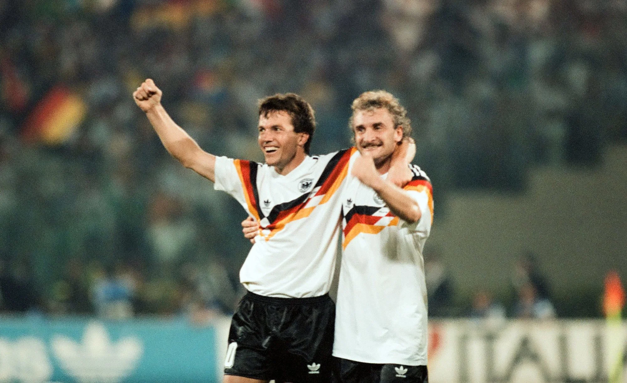
2026 confirms the influence. Germany's 2026 away kit is an almost-direct homage to the 1990 home. The chevron is slightly softer, the flag section extends further down the torso, but nobody mistakes what the shirt is referencing. Adidas has essentially built its entire 2026 Germany campaign around the 1990 nostalgia play. That is the power of one good kit from one great tournament.
1994 — Argentina home
USA 94 was the most commercial World Cup up to that point, and Argentina's kit reflected it. Adidas took the traditional sky-blue-and-white stripes and added a vertical gradient running from pale at the shoulders to deeper sky at the waist. The tournament itself ended poorly for Argentina — Maradona's failed drug test, the early exit — but the shirt outlived the moment. The 1994 Argentina kit is among the most-collected pre-internet football shirts in the world, partly because the team's underperformance made the shirt feel tragic and therefore iconic.
The 2026 Argentina home copies the 1994 gradient almost exactly, just at lower saturation. It's not subtle. It's not meant to be. Argentina's kit designers have realised that Messi's final World Cup is emotionally linked to Maradona's final World Cup, and the kit is doing the heavy lifting in that thematic connection.
1998 — Croatia home
France 98 was Croatia's first World Cup. The red-and-white checkerboard shirt — tiles slightly smaller than the modern version, the white stripes marginally wider — made Davor Šuker's Golden Boot campaign indelible. Croatia went to the semi-finals in their debut tournament. The kit did cultural work that three decades of football diplomacy could not have matched.
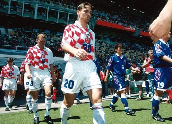
The checkerboard template has been Croatia's visual signature ever since, but the execution has varied wildly. The 2018 version was criticised for muted red tones. The 2022 cleaned up the saturation. The 2026 Nike home is the cleanest since 1998 — wider white stripes, brighter red, moisture-wicking fabric without the shine. Modric's final World Cup as captain is being played in a version of the shirt that Šuker essentially created.
2006 — Italy home
The Materazzi-Zidane final. Italy's fourth star added to the badge. Adidas's azzurro, now in a more technical fabric than 1982, sat alongside a slightly modernised crest and the old four-stars-above-shield layout Italy had worn since the Zoff years. The shirt is remembered not for design innovation but for closure: it's the shirt that completed the cycle of Italian World Cup kits that started with 1970's simpler pre-azzurro.
The 2006 Italy home is the reason Italy's 2026-qualifying kits went so heavily heritage. Adidas is essentially asking what an "Italy kit" means by reaching back through 1982, 1994, and 2006 to find the shared DNA. The Italy kit that exists for 2026 — despite the team's failure to qualify — is one of the finest commercial releases of the decade, and it's directly indebted to 2006.
2014 — Germany home
Brazil 2014. Germany's 7-1 demolition of the hosts in the semi-final. Mario Götze's extra-time winner in the final. And a home kit that paired the traditional white with a red-and-black accent running across the chest — the first Germany home to deviate from pure white-with-flag-trim since the 1980s. The kit design sparked arguments at the time. By 2018 most of those arguments had been settled by the fact that the Brazil 2014 side won the World Cup and the shirt became associated with one of the dominant modern-era performances.
What 2014 established is that traditional national-team colour schemes could accommodate significant graphic interventions without losing their identity. The 2026 Germany home doesn't copy 2014 visually — but it does copy the philosophy. Graphic elements that depart from tradition but remain recognisably Germanic.
2022 — Argentina home
Messi. The trophy. The restraint. Argentina's 2022 home was Adidas's most understated tournament kit in a decade: plain vertical stripes, no patterns, no trim flourishes, just three stars added to the crest after the final win over France. The shirt's minimalism was its statement. Messi had earned the trophy over 16 years of failed World Cup campaigns. The kit didn't need to shout about anything.

The 2026 Argentina home directly descends from 2022. Same silhouette, same proportions, same restraint — with the single added flourish of the subtle 1994-homage vertical gradient. If you squint you can see the whole lineage compressed into one shirt: 1978 striping, 1994 gradient, 2022 minimalism, 2026 Messi-farewell.
Why 2026 is the most self-referential kit cycle ever
Every qualified nation's 2026 kit, with the exception of a handful of AFC-confederation abstract experiments, is referencing something. Mexico is doing 1986. Argentina is compressing 1978-94-2022. Germany away is remaking 1990 at slightly softer angles. Netherlands is reviving 1988 (Van Basten's Euros, which bleeds directly into 1990 World Cup aesthetics). Croatia is fixing 1998. Italy — despite not qualifying — has manufactured a 2006/1994 greatest-hits kit that's on shelves right now.
Why? Three reasons worth naming. First, the 1990-94 collector market is at an all-time high — eBay vintage shirt resales have grown 220% in four years. Brands have noticed. Second, the 2026 tournament skews American-market-facing (USA, Canada, Mexico hosting), and American consumers respond well to 90s nostalgia. Third, the Qatar 2022 kit cycle was criticised as over-designed and samey; Adidas and Nike retreated to safer, beloved templates this time around.
The result is a tournament where every iconic kit moment since 1970 is being quoted, somewhere. Most tournaments produce one or two shirts that matter. 2026 is producing a dozen that are consciously engineered to matter by echoing kits that already did.
Which is a long way of saying: the history matters, these shirts know it, and the next classic is going to be one we've seen before.
Jake runs Footy Kits Battle (https://footykitsbattle.com), a head-to-head kit voting site covering all 48 qualified 2026 World Cup nations.